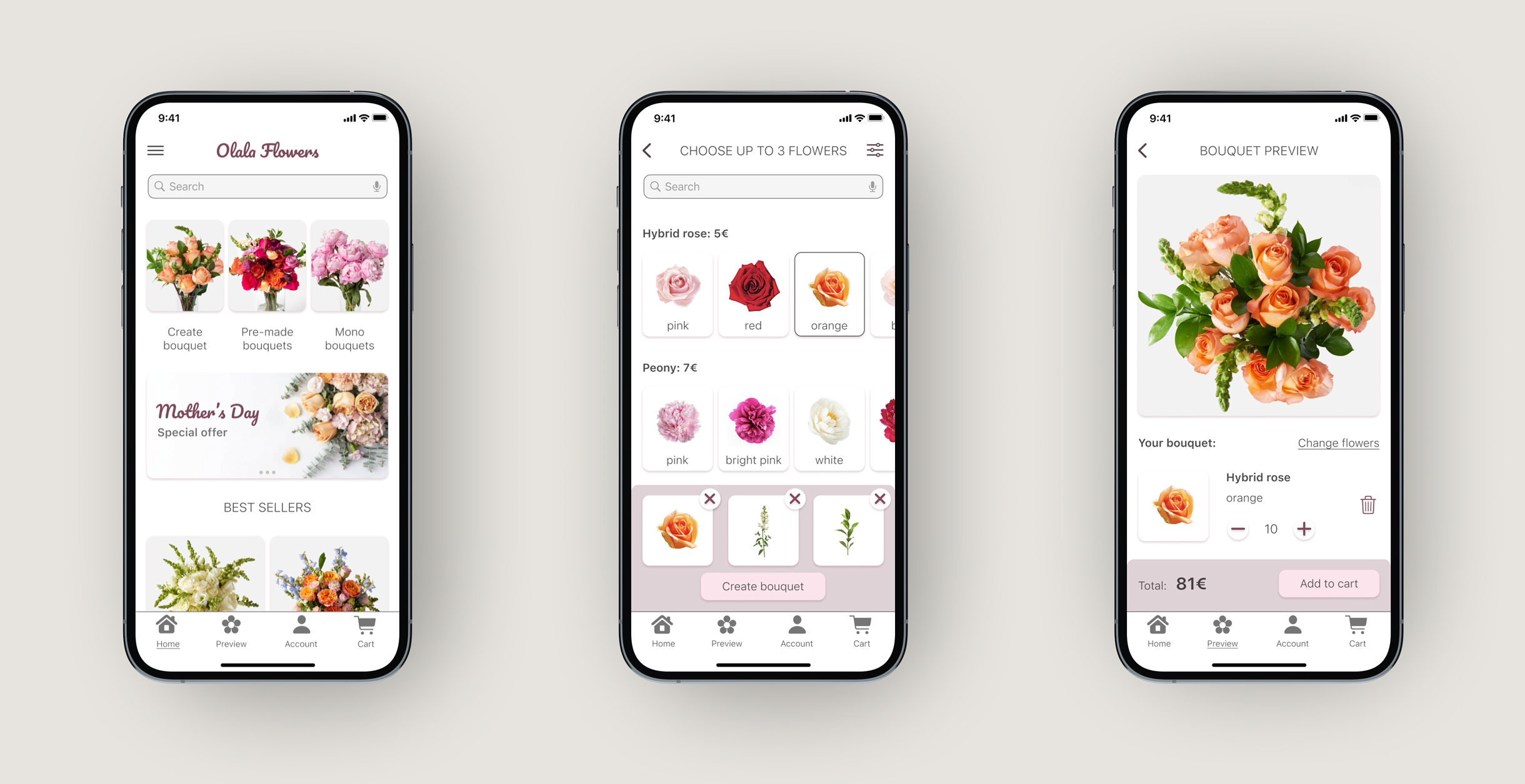
Intro
The bouquet preview app is a conceptual project created for the Google UX Design Certificate course. For this project, I applied the Design Thinking framework to address a challenge suggested by Sharpen generator: Create a bouquet preview app for a trendy florist. While I initially thought this would be a simple app featuring pre-made bouquets, my research showed a gap in the market for a solution allowing users to create their own unique bouquets. As a result, the idea I have developed is purely conceptual and requires specific technology able to create realistic bouquet simulations.
Overview
Task: Create a bouquet preview app for a trendy florist
Duration: February 2022 – April 2022
My role: UX Researcher, UX/UI Designer
Tools: Figma, Miro, Google Docs
Problem: Users want to order customized bouquets but prefer to avoid direct communication with florists, and existing online shops do not offer customization.
Solution: The app will allow customers to create their own unique bouquets
Research
First of all, I had to define the research goal:
Understand users' needs when they purchase flowers online and uncover what are their struggles while ordering flowers online
And the research question:
What are the most prominent pain point people face when ordering flowers online?
To find the answer to this question, I have interviewed people who regularly buy flowers online. Unfortunately, there are few bouquet apps, so most of the interviewed people purchase flowers through an online shop of a particular flower boutique, an online store aggregator, or Instagram.
Persona

Age: 38
Education: MSc in Logistics
Location: Warsaw
Family: Married
Occupation: Senior manager in international logistics company
Artur is a senior manager in an international logistics company, and he often travels for work around Europe. He buys flowers as a sign of love, usually for special occasions. He prefers pre-made bouquets because he doesn't know how to make a good combination. However, he would like the opportunity to customize the bouquet. He would also like to see how the bouquet looks before delivery.
Goals- Be successful in his career, but make sure to stay connected with his family
- Order bouquets and make sure they look as he wants to make his wife happy
- Pre-made bouquets do not always satisfy
- Needs suggestions while buying customized bouquets
- Sometimes the received bouquet is different from the one on the website
Pain points
#1. Communication
Many florists have only an Instagram account and no e-shop. So to order a bouquet, users need to write a message or call. That is not always the most convenient and efficient way. This pain point shows the need for a proper e-commerce solution.
#2. No customization
Pre-made bouquets do not always satisfy, so there is a need for a customized option.
#3. Users need to see the bouquet
Unfortunately, online bouquet shopping doesn't allow users to see the flowers they get, so users are not always satisfied with the final result.
User journey
To see specific areas for improvement, I created a user journey map based on a typical process described by users during the interviews.
| Preparation | Find out what’s available | Customize | Additions: note, toy, chocolate | Place order | |
|---|---|---|---|---|---|
| Tasks |
Know what flower his wife loves Decide on budget |
Write to florist If what he wanted is not available, decide option B |
Seek for advice from florist Decide on what option is better |
Ask what’s available among additional items Write wish note |
Tell delivery address and time Choose payment method |
| Feeling | Inspired but worries about availability | Frustrated if not available Annoyed by long interaction with florist | Lost as he doesn’t know all flowers names and how they look | Annoyed by long interaction with florist | Worried if final bouquet will look like he wants it to look |
| Improvement | Go to app and immediately see what’s available and its cost | Suggestions for similar flowers in search panel | App algorithm that suggests what flowers come together | All additional items are available at checkout |
User’s account with saved info Florist sends picture when bouquet is ready |
Mapping the user’s journey showed the need for an online e-commerce solution for bouquet customization. It also gave an idea of how exactly the app should work and helped the further ideation process.
Problem statement
As a result of the research, I defined the problem statement:
Artur is a working professional and a loving husband. He wants to order a customized bouquet for his wife during work travels but prefers to avoid direct communication with florists, and existing online shops do not offer customization. So how can he order a customized bouquet most conveniently?
Ideation
By this point, I already had an idea that the principal value proposition and the app's main feature would be the possibility of creating unique bouquets. But I didn’t know how exactly it should work. So my goal for the ideation phase was to develop a step-by-step solution.
Competitive Audit
Before creating any sketches for my UX case study, I wanted to explore what competitors in the bouquet business were doing regarding customization options. My goal was to compare the websites and apps of direct and indirect competitors to identify best practices, gaps, and opportunities. Through the interviews, I learned that not many competitors offered customization options, so I wanted to explore whether a total customization solution existed and, if so, how it functioned. You can see the detailed analysis in this spreadsheet.
Gaps
- Low competition among mobile apps
- No existing solution for customization
- Gaps in the products descriptions
Frustrations
- Tool for unique bouquet creation
- Customization of pre-made bouquets
- Efficient search and filter tool
- Detailed product description
Goal statement
To come up with as many ideas as possible, I have used the “How Might We” exercise and the “Crazy Eight” sketching technique. When I explored several ideas, I defined the goal statement:
The bouquet preview app will let users create customized bouquets, which will affect users who do not like pre-made bouquets by allowing them to choose the flowers they like and suggesting to them what flowers will look good together.
Storyboards
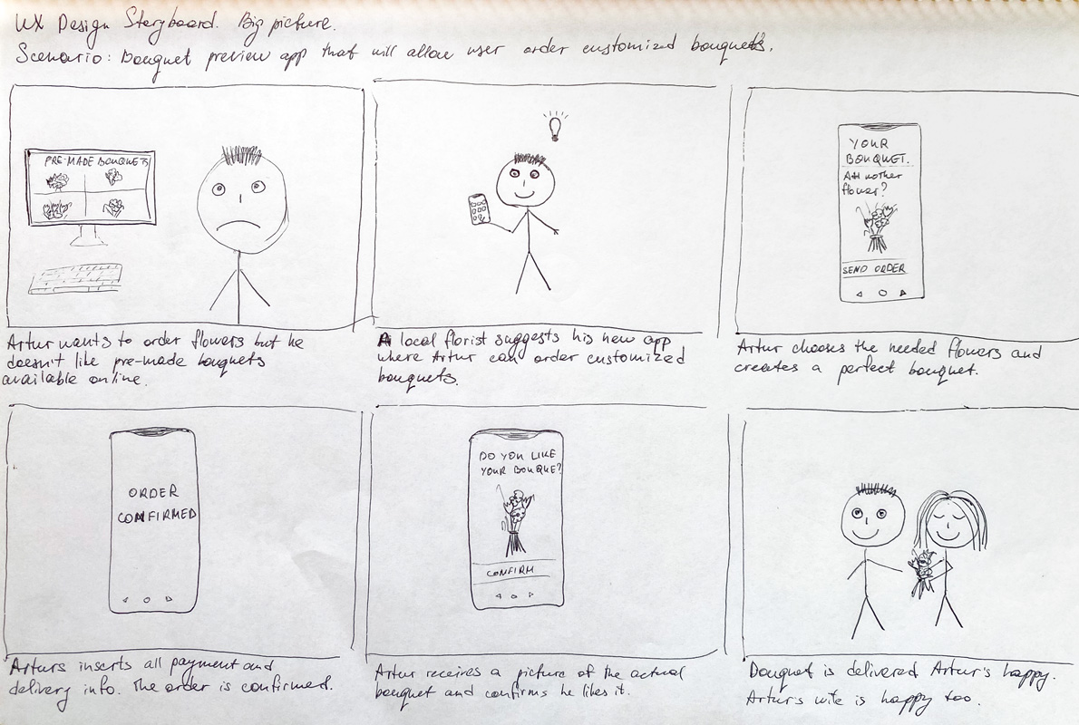
To understand possible scenarios of interaction, I created storyboards. The big-picture storyboard shows how users will interact with the app taking into account the environment and emotions.
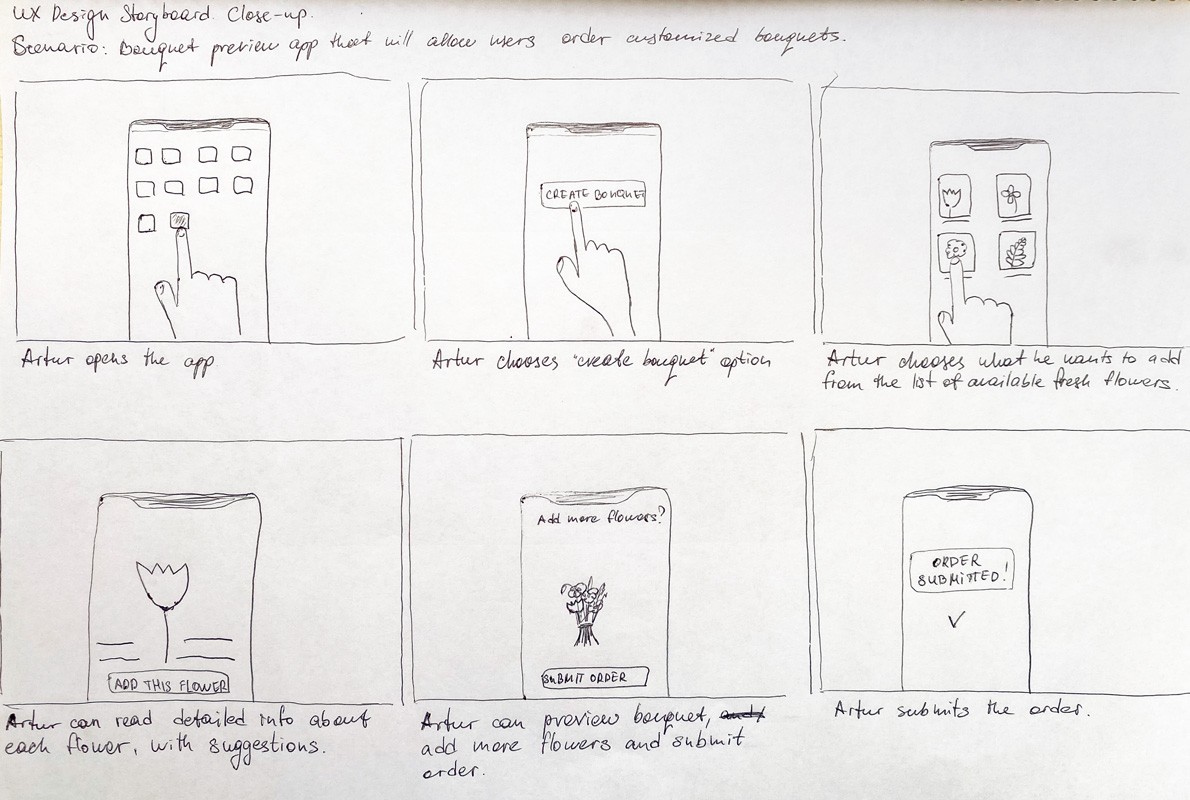
The close-up storyboard explores what happens within the app and what screens and transitions will look like.
User flow
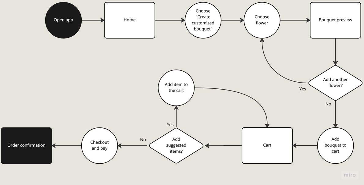
For this project, I focused on designing a user flow where the user creates customized bouquets. This user flow helped me define the specific steps a user should take, the decisions they would need to make, and the screens they would encounter during the process.
Information architecture
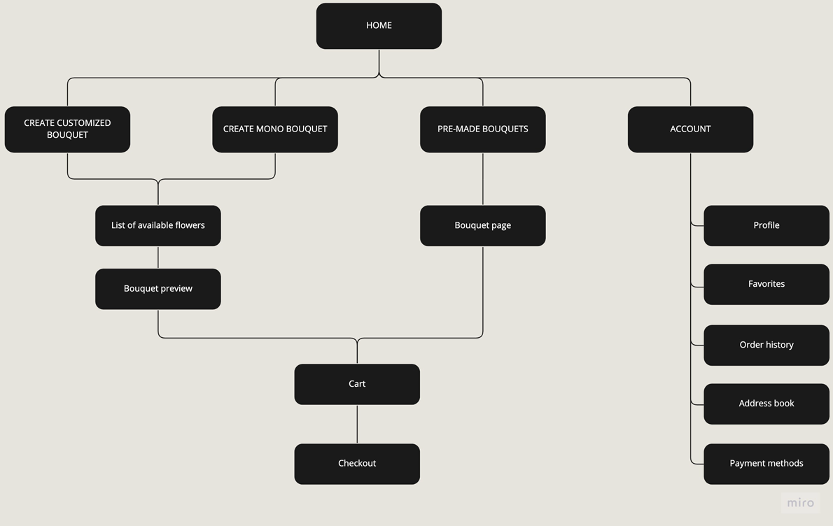
Initially, I wanted the app to have two main flows: purchasing a pre-made bouquet and creating a customized bouquet. However, the research showed that some people buy mono-bouquets, and I decided to make it a separate flow, although technically, it would be the same “customized” flow.
Design and tests
All the ideas I explored during the ideation began to take shape at this moment. As the design was gaining fidelity, I ran two rounds of usability studies, improved some features, rethought others, and learned lots of Figma’s features, including prototyping.
Wireframes
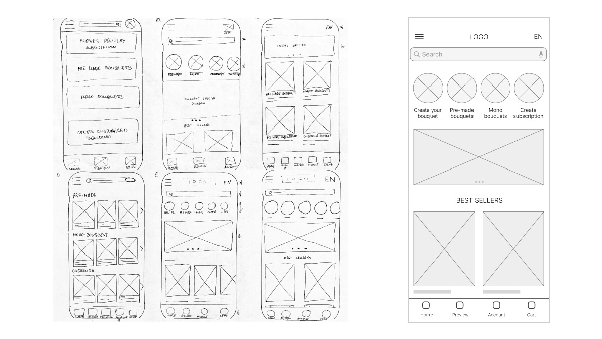
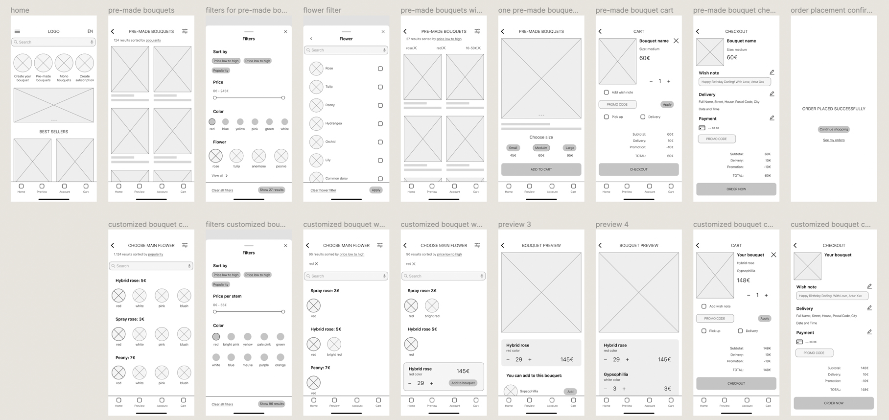
With the help of paper wireframes, I explored several ideas for each screen of the app and finally created the whole set of digital wireframes for the bouquet creation flow.
Usability studies, round one
For this research, I created an unmoderated usability study where participants were asked to create a specific bouquet thinking out loud and expressing any doubts and questions as they interacted with the prototype.
Research goal:
Figure out if creating customized bouquets meets the customers’ expectations and what specific difficulties users encounter when completing the core tasks: create a customized bouquet, complete the checkout process, and navigate within the app.
Research questions:
- Is the process of bouquet customization easy and smooth?
- What are the common issues people face while creating and ordering a bouquet?
- Is the checkout process easy?

With the help of the Affinity map, I created the main themes and identified the following insights:
#1. Re-think the process
Based on the theme that: the flower selection process is unclear and not intuitive, an insight is: users need a more straightforward flower selection process.
#2. Side flowers suggestion
Based on the theme that: users don't know how many side flowers they need to add, an insight is: users need a suggestion on the number of side flowers.
#3. Unclear promo code representation
Based on the theme that: it is unclear why the promo code appeared on two pages, an insight is: the promo code should be entered just once, and it should be clear that on the second page, it's a confirmation.
Mockups
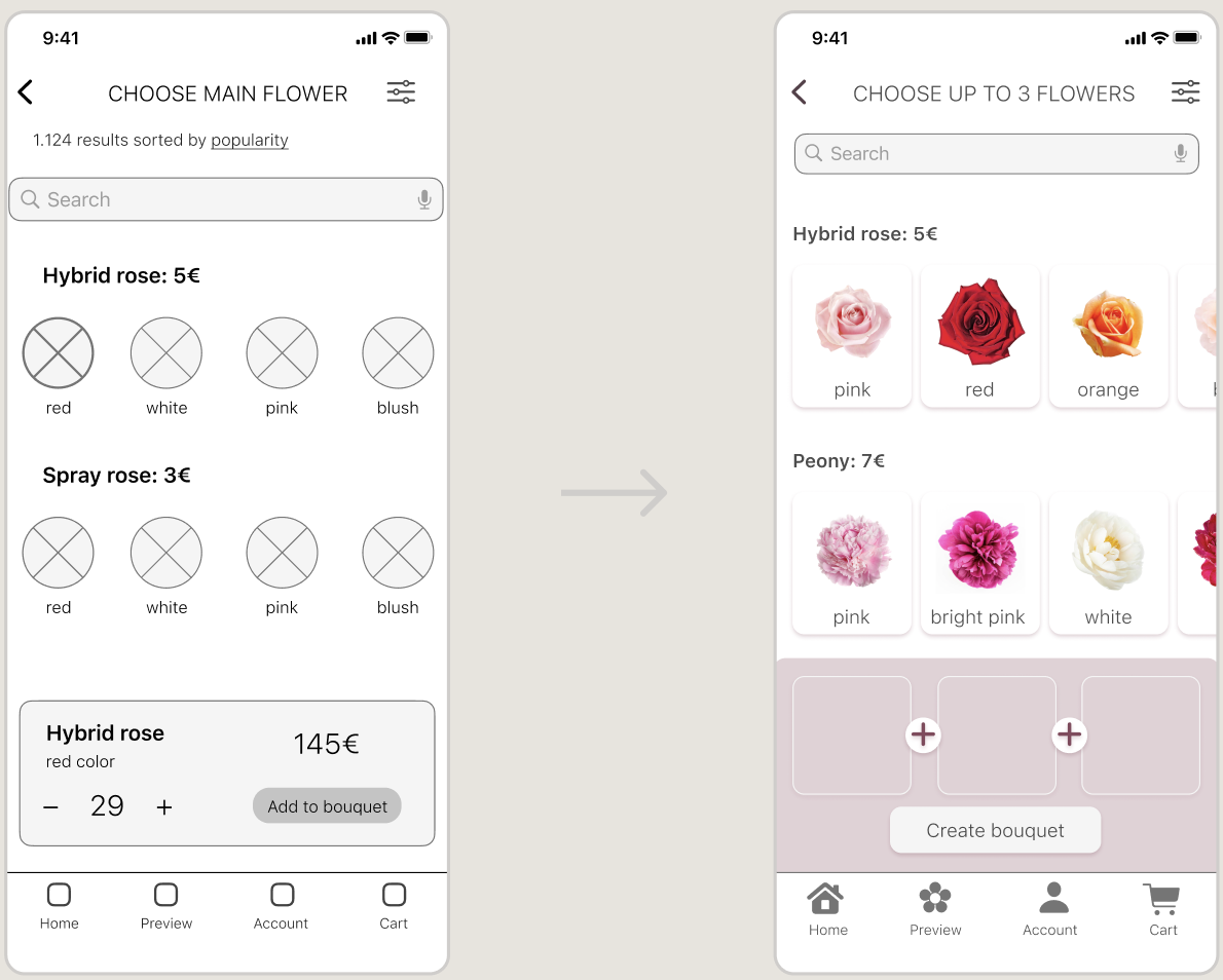
Keeping in mind what needed to be fixed, I created high-fidelity designs. I decided to change the bouquet creation process based on usability study insights. Instead of selecting one main flower, users could now select up to three flowers without thinking about how many of each flower they wanted.
Usability studies, round two
I repeated an unmoderated usability study with similar tasks in the second round. In addition, I asked every participant to complete the SUS survey. The final score of the SUS survey was 85. It meant that the app was usable. However, a closer look at the unmoderated usability study results helped identify areas for improvement.
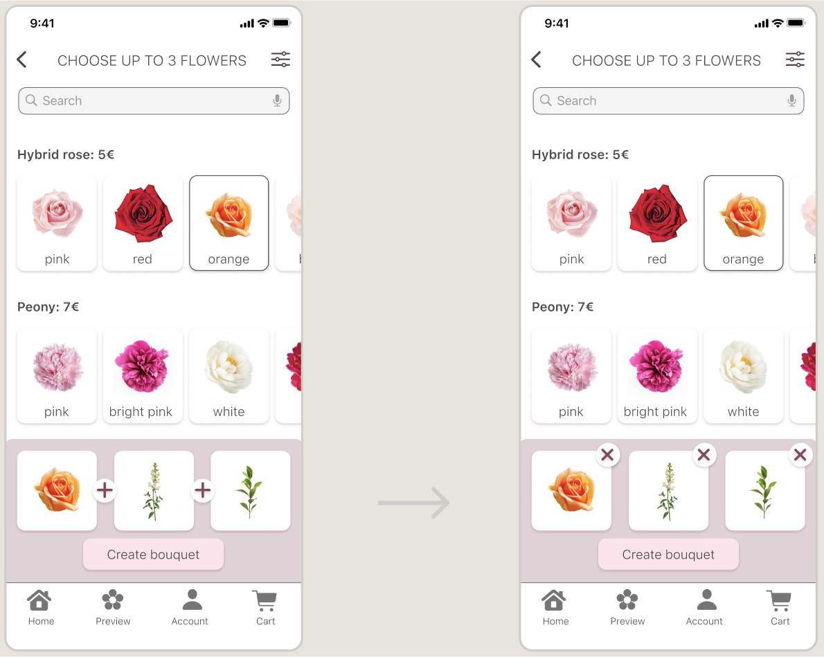
#1. How to deselect?
Based on the theme that: the flower deselection process is unclear and not intuitive, an insight is: users need a more obvious way to deselect the flower.
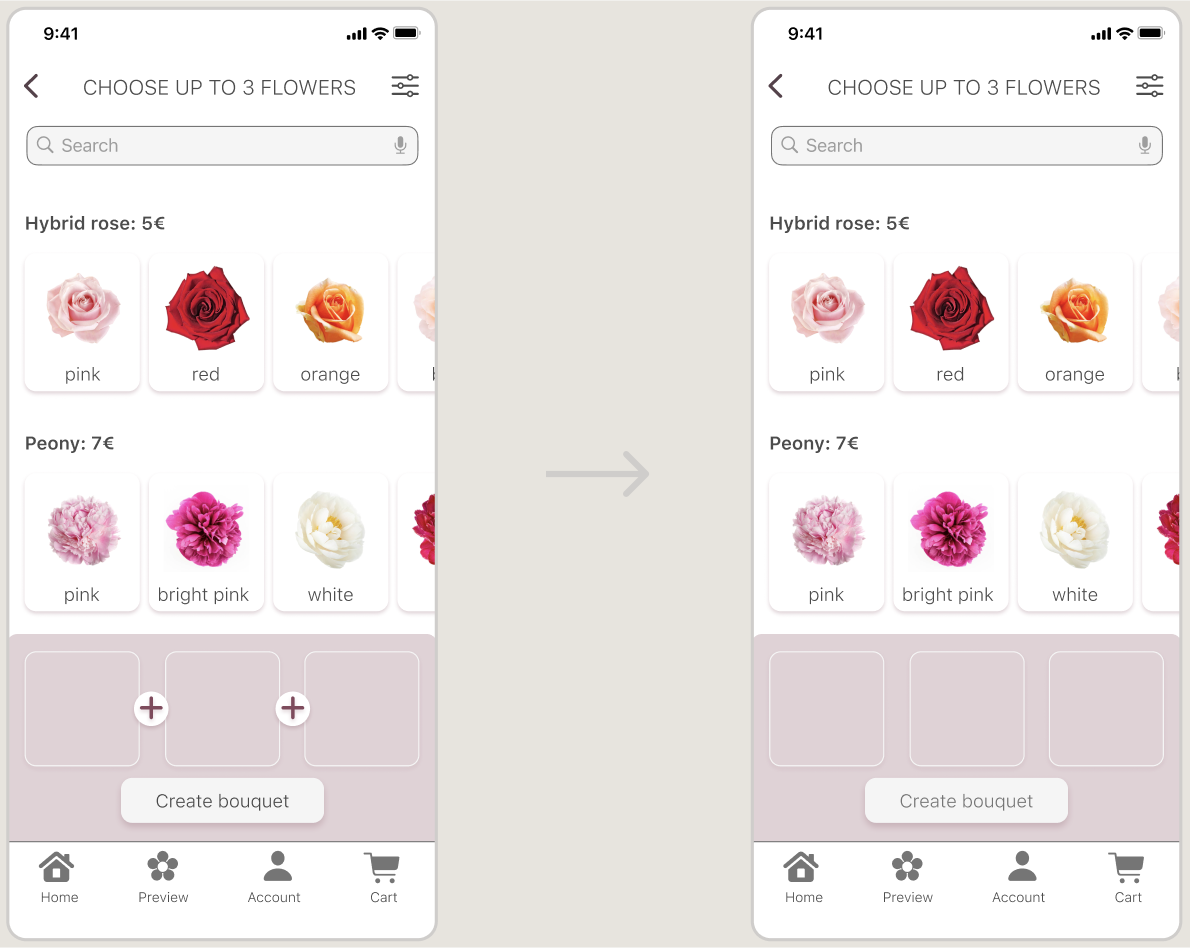
#2. Is this button active?
The disabled button looks active: improve the disabled state.
Final design
In the first high-fidelity design iteration, the user needed to tap on the chosen flower to deselect it, which was not evident and confusing. Now, the user can see how to deselect the flower.
The disabled state of the button was improved and didn't seem active anymore.
Here is the final design for the bouquet creation flow. In the UI design, I prioritized accessibility by following WCAG standards. I paid particular attention to the color contrast ratio for the body text, which was 8.45:1. I also ensured that the body text size was at least 16px, a recommended minimum size for easy readability. Additionally, I carefully selected a color palette optimal for users with different types of color blindness.

UI kit
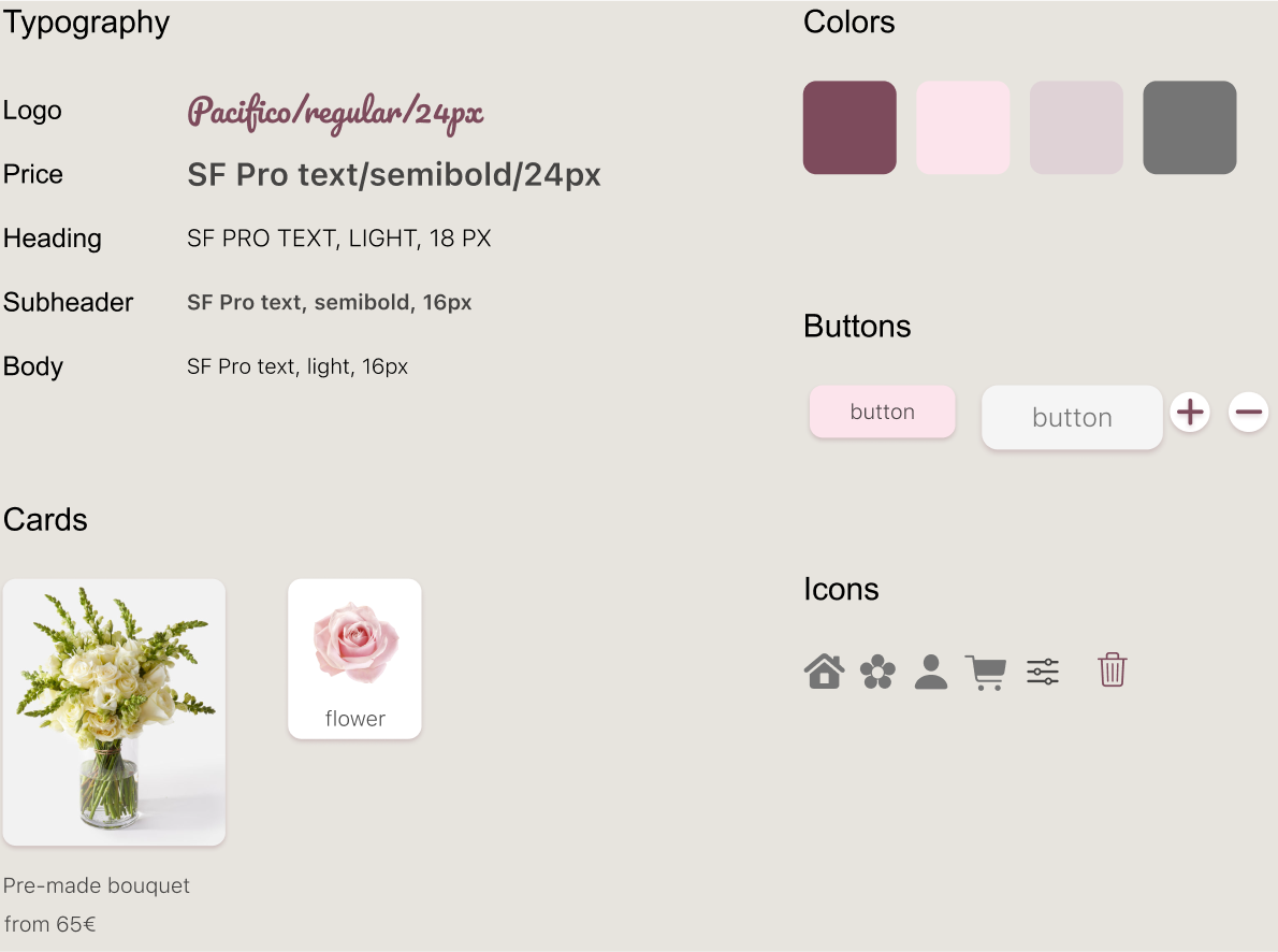
Working on my first design kit, I learned more about Figma, local styles, and components. It helped me develop the app’s design coherently.
Takeaways
The following steps for this project would be to design the pre-made bouquet purchase flow and mono-bouquet purchase flow, user account, onboarding and registration, additional screens such as loading screen, empty state for search, and no internet screen.
In conclusion, this UX case study was a valuable learning experience as it was my first opportunity to explore the Design Thinking framework. I also had the chance to conduct UX research, learn, and use Figma to design my first user interface. Overall, this project allowed me to gain a deeper understanding of the UX design process, learn and grow as a UX designer, and develop skills that will be useful in future projects.